-
Angry Birds Cheese Nips! A Review!
LIKE YOU, I’m a big fan of the game Angry Birds. I’ve mastered every level available except for this goddamn one:
Apparently it’s impossible to get three stars on it if you’re playing it on a MacBook, which I am. However, as soon as they release a version for my 2007 Samsung Flip Phone (Pay-As-You-Go is the way that I go!) I have a feeling I’ll finally be unlocking that last Golden Egg!
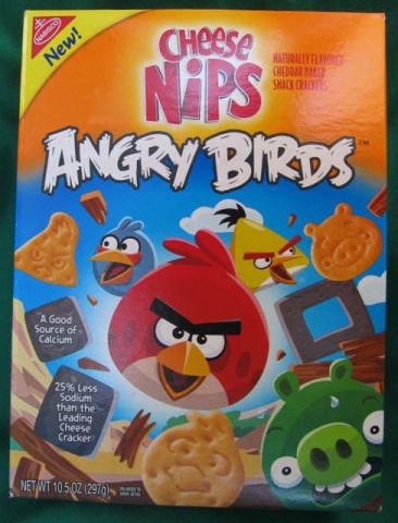
To satisfy my Angry Birds cravings until that happens, I happily discovered last week that the good folks at Rovio, partnering with the gang at Nabisco, have released the latest version in the franchise, Angry Birds Cheese Nips.
I downloaded it off the shelf of my local supermarket into my shopping cart. And since Rovio is famous for providing free updates, if they ever change the packaging design, we needn’t pay for them – it’s simply a matter of ripping open the box and eating them right there in the store. (Just ditch the evidence before you get to the checkout.) By the way, my attorney… —Yeah, yeah, yeah, you know the drill.
Your four main birds are here, the red one, the yellow one, the blue one and the white one, all rendered in amazing whole wheat enriched flour. The boomerang bird is thankfully missing; perhaps due to concerns that it would automatically return – up your esophagus. (Unfounded, I’m sure.) And of course there’s a pig as well:
Oh, it looks like the birds got to him before my photographer did.
Now what’s particularly wonderful, you’ll agree, about Angry Birds Cheese Nips is that the side panel features a handy Angry Birdwatcher’s guide on the side panel:
Let’s go in for a closeup, shall we?
And while it’s of course delightful – it’s also wholly unnecessary! The ‘Nips may not be exact reproductions as though sculpted by Rodin himself out of a solid block of crackermeal, but they are close enough for us to recognize who is who!
…Not the case, sadly, with this bag of cheap Mexican animal crackers I bought the other day!
Why, if any snack is in need of a helpful diagram on its package so that we might identify the shapes, ho ho, brother, it’s this one!
Either that or they should change the name to “Amorphalitos.” Ha! Good one, right?
-
Unreal 77 Peanut Butter Cups: A Review!
LIKE YOU, I love peanut butter – especially in cup form.
Recently I heard about a company that was making peanut butter cups – and other candy – with an eye towards them being a bit more healthy than your traditional candy. They decided to give corn syrup the ol’ heave-ho. GMOs were verboten. (Don’t worry, I don’t know what they are either nor could I be bothered to look it up.) Partially hydrogenated oils were given their walking papers. Artificial flavors, colors or preservatives? Marched out back and shot!
They decided key ingredients needed to be locally sourced, dairy products would have to come from cows raised in pastures, not in airport smoking lounges – and to do it all, they promised to implement e-Verify and hire only Oompa-Loompas that are in the country legally.
…Doompity doo.
The point is, they’re trying to make a difference, dammit!
So after learning all this, I realized something: I really didn’t care.
I really didn’t care because it’s candy, for God’s sake! I’m not thinking “healthy” when I’m treating myself to a piece, or a never-ending series of pieces – one after the other, all afternoon long, while I sit at this God-forsaken desk – of candy! Just like you’re not thinking “healthy” when you eat that potato salad that’s been in the back of the fridge since the Fourth of July. (I’m sure it’s fine.)
And so I think I surprised us both last week when I bought a package of these peanut butter cups at Ralphs – but I didn’t surprise us both too much because they were on sale. I forget for how much, but I do know it wasn’t as cheap as I’d expected. However, it was an impulse buy (industry term) and I further justified the purchase when I remembered that if I blogged about it, I could legally deduct the cost.
So without further adieu (industry term), on with the review!
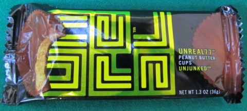
Unreal77 Peanut Butter Cups
Package Design: Pleasant though it would be delightful if it were somehow more anachronistic.
Texture: No complaints.
Taste: They were good.
Portion: Ah, here they get into some trouble. As you know, Reese’s Peanut Butter Cups – the gold standard – weigh in at a hefty 1.5 ounces per 2-cup package. These things, however, are a measly, wispy, ready-to-float-away, gee-can-you-spare-it-you-cheapskate-you 1.3 ounces. That’s a difference of 0.2 ounces! Hell, I don’t have to tell you, you got good marks in third grade math!
So at this point, you’re saying to yourself, “Well, that’s all I need to know. Ted has spoken. And as usual, he’s right – ounce for ounce, my candy dollar goes a lot further by buying Reese’s Peanut Butter Cups. And by ‘candy dollar,’ I mean the money I’m using to purchase candy, not an actual dollar bill made of candy.”
We all know what you mean! But wait just a minute here. You didn’t let me finish. Because there’s something that sets these Unreal Peanut Butter Cups apart from the competition – so let’s begin the unboxing and you stop me when you see what it is…
Anything yet…? No? Okay. We’ll continue.
What about now? Really…? Still nothing? Okay, let’s go in for a closeup…
Still nothing? You really don’t see it? Take a good careful loo–
HEY! You sneaky son of —
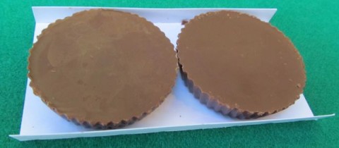
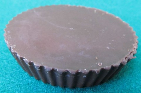
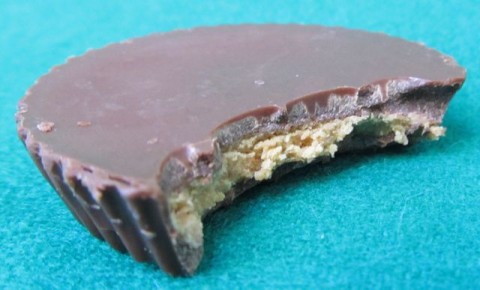
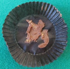
Anyway, clearly, you know what the difference is: These Unreal 77 Peanut Butter Cups are unfettered by those stupid scalloped paper wrappers! Completely unfettered! Where as Reese’s Peanut Butter Cups are fettered by those wrappers, Unreal 77 Peanut Butter Cups are not – they’re totally unfettered! 100% unfettered, these peanut butter cups are! Unfettered by those paper holder things! Okay, I think we’ve got it now.
But yes! There are no annoying paper wrappers to pry off from the bottom of these things! The Oompa-Loompas, with their stubby yet surprisingly nimble dwarf fingers – they do it all for us at the factory!
We’ve all been there: Attempted to remove the brown paper fettering from a Reese’s and lost a good wad of peanut butter cup in the process – that big dollop that remains attached to the paper. And then what do you do? Well, if you’re like me, and I imagine you are, you do your best to slurp it off the paper. But it’s a sloppy endeavor at best and you invariably get some stuck to your nose and lips and then it always ends up smeared on the chalice or floating in the wine when you go up for Communion a few minutes later. And of course someone down the line is going to complain. (Usually that old bag Erma Lockwood with her supposed “peanut allergy.”)
Obviously, this same exact scenario has played out for the good folks at Unreal Candy and they’ve decided to unfetter all of us from the shackles of those little paper things. And that, folks – that is what sets these peanut butter cups apart.
And when you think about it – that big wad of Reese’s matter that ends up stuck to the paper…? It probably weighs more than 0.2 ounces. So if you’re one of those people who doesn’t suck every bit of stuck peanut butter cup off the paper (and apparently such people do exist), you’ll actually be ahead of the game, net weight-wise, by buying these Unreal 77 Peanut Butter Cups!
Still, despite their very nice taste and the ingenious lack of paper fetterment, I cannot in good conscience give these Unreal 77 Peanut Butter Cups an overwhelmingly positive review.
Such reviews are reserved for products by companies that send me boxes of free stuff. And who knows – one of these days, it might actually happen.
-
Best $1.88 I Ever Spent!
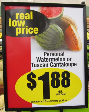
SO I was at the grocery store earlier and I saw this sign!
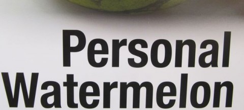
Tuscan cantaloupe? Don’t care. It’s the
that we’re interested in.
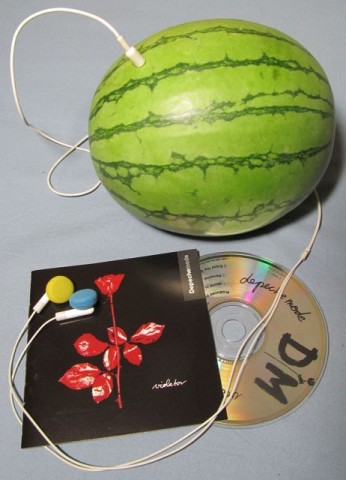
“Hey Ted! What are you listening to?”
“Oh, hey. I’m kinda into the early 90s now…? Your own…personal…watermelon. Someone to hear your prayers, someone who cares…”
“One of these days, Ted, I need to introduce you to Dulcinea.”
“Not Dulcinea Pureheart!”
“Yes! You’ve heard of her?”
“Are you kidding? She’s a personal watermelon of mine!”
“Jeez, Ted, look at you! Someone’s been hitting the gym…!”
“Oh, thanks man. I’ve been working out with a personal watermelon.”
“Lunch next week, Ted?”
“Sounds good. Why don’t you call my personal watermelon and have her set it up?”
“Ted! When did you get a Lexus?”
“Hell, with the settlement my personal watermelon attorney got me, I’ve got a fleet of ’em!”
“Thanks for coming down to Human Resources, Ted. This is never easy, but some of the other employees in your department – and I can’t name names – well, there’s been some…concern about your personal watermelon.”
-
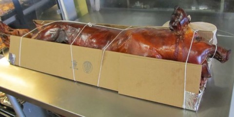
Disgusting Pig!
SO I just ran up to the Filipino market up the street to pick up some takeout…?
Since I was there anyway, I just made a quick run around the store to see if there was anything else I needed.
And I found something interesting.
I wouldn’t have thought it, because I’d never heard of her before…? And I didn’t realize she was that famous…? But the star of that movie I rented last night apparently has her own line of foods!
And this Ginger Juice is “instant” – unlike the actress Ginger Juice! I’m telling you, I had to fast-forward through titles, credits, and probably six or seven minutes of pointless setup and talking -talking-talking…!
Enjoy this one, folks – by tomorrow I’ll probably have come to my senses and pulled it down.
-
Delightfully Anachronistic Package Design: Summer 2012 Edition!
IF THERE’S SOMETHING that we all can agree on in these troubled economic times, it’s that everyone enjoys delightfully anachronistic package design – and rightfully so.
And by “delightfully anachronistic package design,” I mean packages – usually of food, and often bought at a local dollar store – that have the look of something that was designed decades ago and never updated. I find this phenomenon absolutely delightful and now…? Now, friend, so do you. Like watermelon-flavored Visine, it’s a treat for the eyes. Oh ho ho, watermelon-flavored Visine! Where do I come up with this stuff?
So, uh, here’s a bunch of things I found that look old.
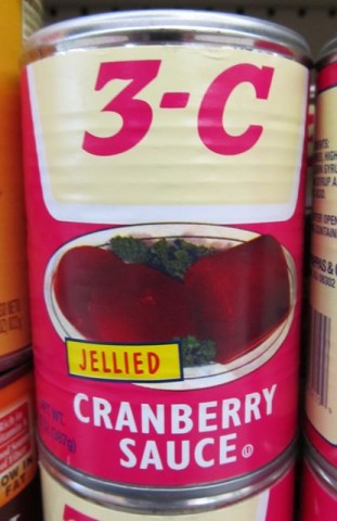
3-C Jellied Cranberry Sauce That Looks Like It’s From, Oh, Let’s Say the Mid-1960s
I found these in a wonderfully ratty dollar store in Carson, California months ago. But I’ve been saving the photo for a special occasion. Tonight’s the night, baby! Tonight’s the night!I didn’t buy them, I just took a picture (because it’ll last longer). What does the name “3-C” signify? Look, I just told you I didn’t buy it, so I have no goddamn idea! Let’s say it stands for priCe, Cwality, and, eh, Cranberries. I’m sure it’s a fine product.
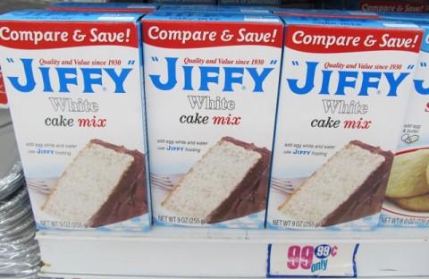
Jiffy White Cake Mix Looks Like It’s From the 1930s
Yes, I’ve covered Jiffy mixes in depth previously. All of their packages have a distinct anachronistic look to them. But this is the first time I saw the white cake mix before. White cake mix? That’s racist! And delicious!Libby’s Chunk and Sliced Pineapple Looks Like They’re From the Mid 1960s
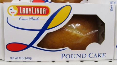
Now here’s a tough one. I found these at my local Dollar Tree and the package design is very new – I forget what Libby’s canned fruits used to look like, but one thing’s for sure, brother, they didn’t look like this! These have a very 60s kind of style to them, but by Godfrey, if I find out this is an intentional attempt at a “retro” look, then they’ll be immediately disqualified and not allowed to compete. I’d like to think, and now you do, that this is just a label redesign that somehow looks old to me (and now you). Dare I include it here? As it turns out, I already have.Lady Linda Pound Cake Looks Like It’s From the 1970s
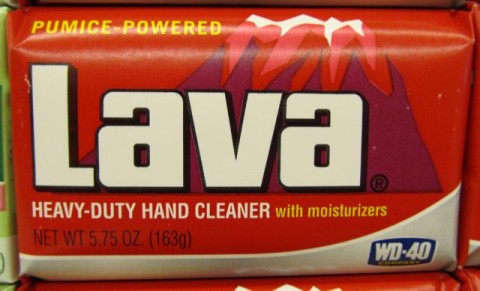
Ha! A so-called pound cake – that weighs ten ounces! (Settle down, settle down – I’ve already got my attorney on top of this.) Anyway, the lovely Lady Linda logo looks like something from about forty years ago, doesn’t it? …Kind of? Look, they can’t all have the striking visual anachronicity (a word I’ve apparently just coined and will soon trademark) of Jiffy cake mixes.Lava Heavy-Duty Hand Cleaner Looks Like It’s From the Late 1960s
Aside from the addition of the WD-40 logo to the bottom and a few minor changes to the text (the omission of the exclamation point after “PUMICE-POWERED,” changing “THE HAND SOAP” to the current “HEAVY-DUTY HAND CLEANER with moisturizers,” among them) Lava’s wrapper is practically unchanged since 1960s, which is particularly amazing and wonderful. It’s such a great design it’d be a shame to change it. Lava soap has always been a small, specialty brand, and I bet if it had been owned by some huge Big Soap corporation, we’d be looking at swirly design things all over the package. Either that or photo-realistic globs of glowing, shimmering lava with highlights galore.Say, look – it still pretty much matches its corresponding 70s Wacky Package:
By the way, like you, I love Wacky Packages, used to collect Wacky Packages, and permanently stuck Wacky Packages to the closet door in my bedroom. And I still say, this is the worst parody name in the entire Wacky Packiverse. “Lova”…? What the hell…?! Clearly Art Spiegelmaus and Bob Shtewart just wanted to knock off early the day they came up with this one. “Lava Soap…Hmm…Tough one…Bava, Cava, Dava, Fava, Gava…” “Lova Soap! These are eight year olds we’re writing for. Good enough! Now let’s hit Buffalo Wild Wings for lunch!”
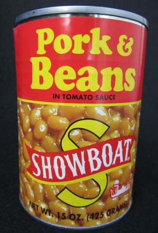
Showboat Pork & Beans in Tomato Sauce Looks Like It’s From 1923
Here’s a secret the Bush’s Beans people – even the talking dog – don’t want you to know: They’re the company behind these value-priced Showboat Pork & Beans. Okay, maybe they don’t care if you know, since their name and website are listed on the back of the label. You’re probably asking aloud “Why does this jackass Ted think the can looks like it’s from 1923?” I’ll tell you why if you just shut up a minute: the typeface used for the words “Pork & Beans” is in fact the same used throughout a 1923 Sear & Roebuck catalog I found in Nana Parsnips catalog heap (in what used to be the shower). Add to that the “Showboat” name and logo, and, well sir, you’ve got a canna beans that looks like it’s 89 years old!Breakstone’s TempTee Whipped Cream Cheese Looks Like It’s From 1982
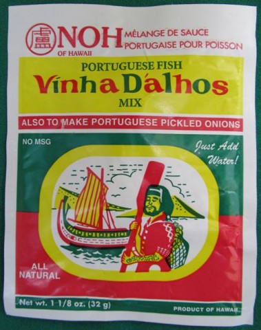
We don’t normally have Breakstone products out here in the filthy toilet that is Los Angeles, but oddly, they do turn up occasionally in – where else? – the 99¢ Only Store. And when they have TempTee whipped cream cheese, brother, I snatch it up by the palletful! So you can consider this entry a mini-What’s Bueno at the 99¢ Only Store post too – this stuff is just that good. Anyway, the pseudo-handwritten product name, the bright pink color and the little yellow stripes all scream the early 1980s. But be warned – the name and color seem to imply that this is some sort of light version of cream cheese – this, my calorie-counting pal, is not the case. It’s just whipped, but has the same amount of fat as regular cream cheese. This is why I limit myself to just one tub for dessert, during “Wheel.”Noh of Hawaii Vinha Dalhos Portuguese Fish Mix Looks Like It’s From the Late 1950s
Just as you would, when I saw this at Big Lots for just 80¢, I had to try it. And not because I was at all curious about the taste, either – it’s that amazing three-color design that we found so nifty – to use the very vernacular of the era that I think it kind of looks like it’s from. Anyway, I had Ildefonsa fry me up some fish with it and it came out, well, okay.The thing is, your best, tastiest fish today are your overfished fish – your European seabass, your snapper, and my favorite, your orange roughy. A good rule of thumb is the more endangered the species and the higher the price, the tastier the fish. So I got Ilde up at five one morning last week, gave her twenty bucks to pick me up a couple of good, thick, New York-cut orange roughy filets from the Santa Monica Fish Market and even gave her an extra buck to help with fares on the six buses she’d need to take to get there.
Maybe it was the deliciously overpowering taste of the fish sauce and the fact that Ildefonsa oddly decided to cut them into eight uniformly rectangular slices before serving them to me, but they just didn’t taste like orange roughy. But she insisted, in her angry broken Germ-glish, that it was orange roughy. As much as I personally dislike the woman and constantly threaten her with deportation (more to scare little Kayla when she doesn’t behave), “Fat Frau Blucher” as I call her (she doesn’t get it!) has a good heart. She tells me it was Mr. Whisker’s birthday and that was why I found this box in the garbage…
…along with all the breading she patiently scraped off. (Damn cat’s apparently allergic to gluten now.)
Well, we all had some fun, but the booze is wearing off so I think we’re done here for now. Also, it’s just now occurred to me that we usually celebrates the pets’ birthdays along with the kids’, all on one day, December 25, every other year. Huh.
-
One Fine Day In the Meeting Room of the Discount Breakfast Cereal Company!
“Awright you two, the boys in Research & Development have given us a great new sweetened multi-grained cereal – now it’s up to us to design the packaging!”
“Okay, boss – what’s the flavor?”
“Good question, Jones – it’s ‘honey oat.'”
“Well, I think we should really focus on the flavor and—-”
“—-Flavor, schmavor! Jones, you and your half-baked ideas of package design! What I want to know, boss, is what’s the cereal shaped like?”
“Let’s see, Wilson – they’re, eh, little rings.”
“That’s it! Perfunctory nod to the flavor (keep Jones happy) – but clearly we need to highlight the shape.”
“Sounds good to me! We’re done here! Buffalo Wild Wings for lunch, everyone?”See, the word for the shape is bigger than the words describing the flavor, which is what most people would be concerned with.
-
Big Lots Presents Christmas in July!
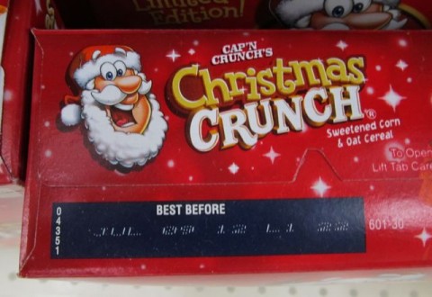
SO I WAS AT my local Big Lots the other day, searching for recently expired “limited edition” holiday-themed breakfast cereal.
I wasn’t disappointed!
By the way, like you, I detest this current version of Cap’n Crunch. And I say this with a certain amount of trepidation, because there’s some graphic artist out there who drew this – and by the way can draw way better than I ever could – and he (or she!) is just doing his (or her!) job and probably is merely giving the Quaker people what they want.
Not literally the Quaker people – that is, not the religious sect – but “the Quaker people” meaning the people at Quaker Oats, itself a division of PepsiCo since 2001. But who’s to say the people at Quaker Oats / PepsiCo aren’t themselves of the Quaker faith? Who’s to say?
Also, did I ever tell you how I used to be a delivery boy for PepsiCo? It’s true! Well, not technically PepsiCo, but for a company that exclusively did graphics work for PepsiCo’s in-house art department. Oh, it was years ago.
There! Purchase, New York! I was a strapping young man, the summer after graduating high school and—-
Oh forget it.
Anyway, my point was that I hate how Cap’n Crunch looks now, and now, so do you.
His head and nose is the same size and shape of the hideous 70s-80s-90s version of Fred Flintstone. Why can’t they go back to the more stylized, original, 60s, Jay Ward Studio design? Of Cap’n Crunch, not Fred Flintstone! Nobody likes a smartass.
It’s not like there’s nobody around who could draw the Cap’n like that. I mean, Flickr is full of you people who delight in drawing vintage characters the way they’re supposed to be drawn and also better than me. So hop to it! Get those cocktail napkins and Prismacolors out! Get to work! Chop-chop!
And you guys at PepsiCo-slash-Quaker Oats! You keep doing your silly Pepsi “Throwback” vintage cans and your retro cereal boxes – well, for God’s sake, get your heads out of your asses and okay a non-limited edition redesign for the Cap’n Crunch box!
I can’t believe I have to be the one – yet again! – to state the obvious! My God, you PepsiCo people and you Flickr folks – you’re perfect for each other! Everyone sees it but you two! Everyone! The way you’re always teasing each other whenever we all go out. And you always manage to sit next to each other when we go to the movies. Jeez, it’s so obvious you’re into one another! What the hell is it going to take to get you two together?
Wait, wait. There was something else I was working towards here…
Oh, yes – went to Big Lots, found the expired cereal that’s been sitting there since last year, continued poking around, saw these things:
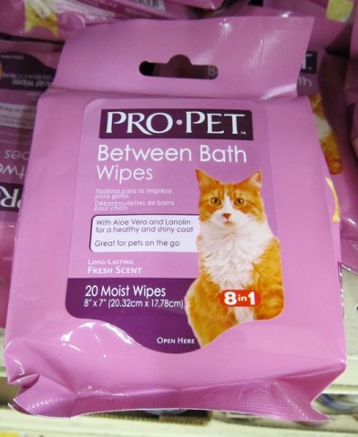
So just how lazy is your cat that you’re buying these?! Cats are the one self-cleaning pet that there is!
“Between Bath” wipes?! Who bathes a cat? If I was stupid enough to try to get Mr. Whiskers anywhere near the tub, it’d be off to the emergency room for stitches and tetanus shots for me, brother!
Hell, I can’t imagine even trying to wipe him down with what amounts to be a Wet-Nap without putting on my chain mail shirt, motocross helmet and black rubber welding gloves. (And with my luck, then Debbie walks in and wonders why I’m wearing the outfit when it’s not even Saturday night and the kids aren’t at her mother’s.)
And “great for pets on the go”…?! On the go where? Who brings a cat anywhere? Cats aren’t “on the go.” They’re the “stay-behind” pet! They’re the Official Stay-Behind Pet of the 2012 Summer Olympics! They’re everywhere they want to be, which is at home! “Pets on the go…!” Sheesh.
So, by abruptly switching gears and completely changing the subject halfway through, making obscure cartoon references that only a handful of people will get, constructing elaborate and abstract analogies that make sense to even fewer readers, and going on for way too long, that’s how I single-handedly blew out the transmission of a blog-post heading down the internet at 80 miles an hour at three in the morning and managed to lose most of my, what, six regular readers.
“Oh Commander, that’s amazing!”
Quite.
-
What Did I Tell You!? What Did I Tell You?!
I told you! I knew it! I just knew it!
Remember how I wrote about Wendy’s precious new “baked sweet potato” some time ago? Remember?
Well, if you don’t remember, here’s my review for you to re-read and refresh your memory!
Anyway, remember, specifically, how I wrote – and I quote – how I wrote,
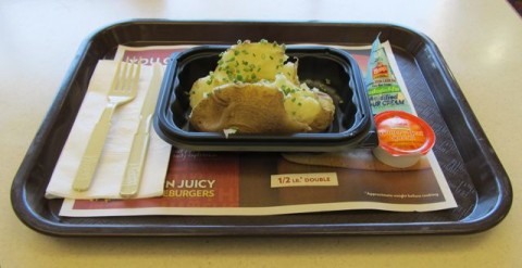
Remember how I wrote that? Yeah, well, today I went to Wendy’s and this was the only potato available!
What kind of potato is that? I’ll tell you what kind of potato is that! It’s a regular potato is what it is! There are no “sweet” potatoes at Wendy’s anymore! The so-called “sweet” potatoes are gone, pal! The whole place has been scrubbed of any reference, allusion, mention – any trace of them! Gone!
It’s like the whole thing never existed! But we know different, don’t we?
Also, their precious macaroni and cheese “Signature Side” has also been discontinued (industry term), probably at the same time, but I’d like to think that they gave the ol’ sweet potato the axe first, if only by a matter of seconds. Even if it was just mentioned first in the sentence when Wendy’s Vice-President in Charge of Discontinued Menu Items announced “Effective immediately, we’re discontinuing the baked sweet potato and the macaroni and cheese. That is all. Over.” Into an intercom on his desk, I’d like to think.
Into an intercom on his desk and it’s simultaneously broadcast through a sort of school p.a. system in every Wendy’s all at once. Man, can you imagine wielding that kind of power? To just push a button on your desk and speak into a little box and discontinue a menu item?! How cool is that!
The third of Wendy’s precious “Signature Sides” – the chili cheese fries? Still there. Exactly like I kind of predicted! Exactly!

Frankly, chili cheese fries at Wendy’s is a no-brainer and I’m surprised they didn’t come up with that years ago, on account of they sell fries and they sell chili there anyway. Considering all the times people eating from open jars of peanut butter used to bump into other people eating large chocolate bars, doesn’t it stand to reason that at some point over the last forty some-odd years in at least one of Wendy’s 6,600+ locations, someone carrying fries would accidentally slam into someone carrying chili?
But I guess it doesn’t matter how it happened, just that it did happen.
-
Now I’m Going To Be Hearing “I Told You To Write It Down!” For The Next Two Weeks!
SO LORI CALLS ME at work and asks me to pick up something for her on the way home. Fine; no big deal, right? Mm.
This is apparently what she wanted:
This is what I got:
But like I told her – they say you’re supposed to switch your deodorants every so often anyway, right? And I’m sure the big presentation she’s giving tomorrow that she’s been so stressed about will go fine.
Oh, believe me, folks – the copy I originally wrote for this one was worse.
-
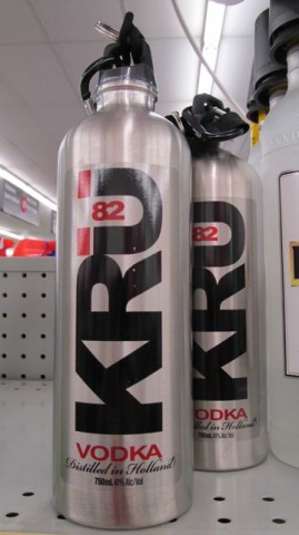
An Innovation In Alcohol Packaging Long Overdue!
YOU PEOPLE are always telling me I gulp down vodka like it’s water; well, now you know why!
Look! Look!
See! It’s not my fault!
And on the plus side, now I can finally get rid of that stupid hip flask I’ve been carrying to the gym in my tube sock.
Ted Parsnips
?>