-
Did This Blog Play A Part In The Making of Tim Burton’s Margaret Keane Biopic “Big Eyes”…?
YOU’RE FAMILIAR with Margaret Keane’s work, of course – the kitschy paintings (and prints, and posters and postcards and so on) from the 1960s of the sad waif-like kids with the big eyes. Why, you yourself probably collected them as whatever forerunner to today’s hipster you didn’t consider yourself, but actually were, 20 years ago, when they’d still occasionally pop up in thrift stores. Did all that make sense?

And you must have heard about the movie “Big Eyes,” but if not: Why, it’s a marvelous little film that tells the story behind those peepers and finally gives artist Margaret Keane her due. A Tim Burton film it is, believe it or not – despite neither Johnny Depp nor Helena Bonham Carter being anywhere in sight, and with a soundtrack by, yes, Danny Elfman that somehow doesn’t go dunt-dunt dunt-dunt dunt-dunt, BOOM BOOM! BOOM BOOM!, dunt-dunt dunt-dunt dunt-dunt, BOOM BOOM! BOOM BOOM! And so on.

I won’t waste your time commenting on the film itself other than to note I liked it nearly as much as I hated “Charlie and the Chocolate Factory,” which is to say, “quite a lot.”
What I will point out though is that the look of this film (set mostly in the late 1950s and early 1960s) is pretty much flawless. If you’re an annoying hipster of today (or whatever the rest of us all were 20 years ago), one thing’s for sure – you’re just going to go on and on and on about all the “mid-century” set design and decoration, because if there’s anything hipsters of today (and of the last 20 years) love more than “mid-century” furnishings and architecture (and “Eames Era”-anything), brother, I don’t know what it is. Well, other than just saying the phrase “mid-century.” Or using it to describe their eBay offerings.

But where does your old pal Ted and his unassuming little blog come in?
At one point in the film – spoiler alert! – Margaret is worn down from painting her Big Eyes non-stop and, at a supermarket, hallucinates seeing people in the store with similarly enormous orbs. At the beginning of the scene, Keane (Amy Adams) walks by an endcap (industry term) of Southgate products. Oh, they’re out of focus, sure, but make no mistake – they’re Southgate, all right!
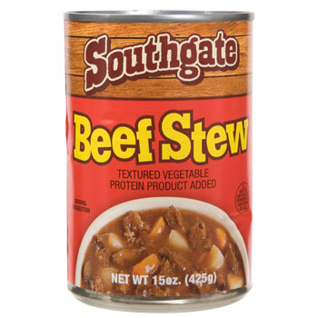
“Wait,” you say, “Southgate – that sounds familiar…” Well, for God’s sake, it should – their products were featured twice under my brilliant Delightfully Anachronistic Package Design posts. It was even on the mid-term!
Anyway, a moment later, another shopper turns to look at her, and…
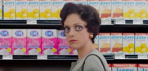
…well, if you’re like me – and you are – you’re dumbstruck to see an aisle largely comprised of Delightfully Anachronistic Package Design Hall-of-Famers: Jiffy brand products. Also, apparently the image of the shopper herself is slightly off-putting as well. I guess.
And so I say to you: Clearly someone on the production team for this film did a Google search on “anachronistic package design” to look for contemporary items they could use in this scene, happened upon my blog, realized “By Godfrey, this Ted fellow has done all our work for us!” and ordered a few dozen cases of Southgate and Jiffy products for that period look they were going for.
Clearly this is what happened.
I imagine everyone involved in the production of the film will deny it (of course!) but I’ll be nice and keep my mouth shut for a while and not tell anyone (aside from you, my – what? – six readers). But the day will come when I’ll refuse to keep living a lie, come clean and the truth will be out. Also, I imagine there’ll be some kind of lawsuit with a dramatic courtroom scene.
Eventually, however, I’ll be recognized for the genius I am (and you guys are ahead of the rest of society on this one, already aware of this as you are) and perhaps, a movie will be made about my whole ordeal.
I just hope at that point Amy Adams will still be young enough to play me.
-
Delightfully Anachronistic Packaging! Halloween Edition!
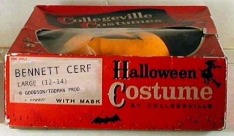
ON HALLOWEEN when I was seven, I went trick-or-treating as, of course, Bennett Cerf.
I’d hoped to dress as Mr. Cerf the year before, but the five and ten had quickly sold out of his costume and the closest thing available was his “What’s My Line?” co-panelist Dorothy Kilgallen (with inexplicable day-glo yellow molded “hair”).
Mother – not an artist! – tried to transform her into Bennett by drawing eyeglasses on the mask with a laundry marker. Everyone whose doorbell I rang asked me where Yoko was.
That next year I made sure to get to the store the first day of October to buy my Cerf costume. Unfortunately, Woolworth’s buyer only ordered the large size, for the big boys, but I was bound and determined to go as my favorite television personality.
Grandmother pitched in and hemmed the legs of the costume so I wouldn’t trip, but the mask was a different story – it really couldn’t be trimmed down without rendering unrecognizable the likeness of America’s leading publisher and compilator of puns. The plastic mask was much too big and sat awkwardly on my face. Instead of looking out both of the eyeholes, I was struggling to peer through one nostril, or if it shifted, the bowl of his signature pipe.
When the big night finally arrived, it was particularly chilly. But I ditched my coat as soon as I got away from home so that the costume could be appreciated, unfettered by children’s clothes, by all whose doorbells I rang. (Did the real Bennett Cerf wear a green Sears Toughskins jean jacket over his suit and tie? It seemed unlikely. Although to be fair, I never saw him in a one-piece flame-retardant vinyl outfit that tied in the back and featured his own name in playful, toggled letters and a two-color caricature of himself in the middle of his chest, either.)
I guess I couldn’t see where I was going when, giddy on SweeTarts and Mary Janes, I darted out between two parked cars on Gate Field Drive. Some jackass in a Plymouth Duster plowed right into me, literally knocking me out of my PRO-Keds (which was fine, really – Bennett Cerf didn’t wear those either).
Doctors said the ensuing concussion plus some viral thing I developed from my walking pneumonia (no jacket, remember?) short circuited something in my brain and accounted for my sudden obsession with delightfully anachronistic packaging – which lucky for all of us continues to this day.
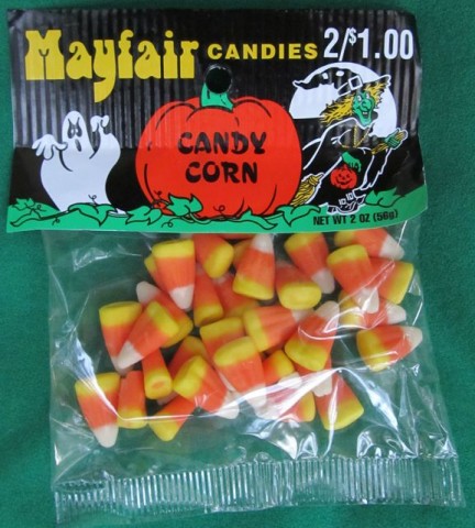
Boy, that was a long trip to get here, wasn’t it? But as usual, it was worth it! So I was at Ralphs the other day and they had these:
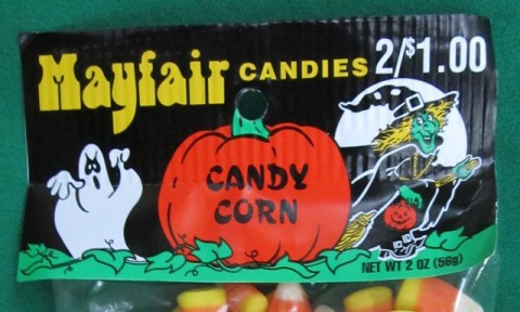
Above: Mayfair brand candy corn. Oh boy, two ounces – can they spare it?
But look at the hang tag (industry term). It totally has a 1970s look to it, right?
Look! Look!
Check out the typefaces, the style of illustration, and the colors! It’s like it’s all right out of the glorious 1970s, right? And yet you can buy this, right now, today, in October, 2012, at the store.
It’s not as though they tried to make it look old – you and me, we can always spot those guys a mile away, can’t we? Such packaging just rings hollow and insincere. But not Mayfair Candies candy corn. This is the real deal. I reckon this is how they’ve been selling their candy corn since the Ford administration – back when tragedy, and a car, struck a young boy, shattering his hopes and dreams and pelvis.
Worst of all, by the time I came out of the coma, my sister had eaten all my candy.
-
Delightfully Anachronistic Package Design: Virginia Edition! Part III!
MY fascination with delightfully anachronistic packaging is easily explained: It reminds me fondly of simpler times and days gone by. You see, I was born in 1930 and when I was in my twenties, I worked at the Finast supermarket on Main Street in Galesburg.
One day ol’ Mr. Finney had me setting up a large cardboard “Tom Corbett: Space Cadet” display for Kellogg’s Pep when the flashlight battery-driven spinning antenna on Tom’s ship, the Polaris, came in contact with my box cutter which had evidently built up quite a charge of static electricity slicing open cases of Ipana toothpaste earlier that morning. Zzzzzap! The next thing I know here I am in the twenty-first century.
Okay, enough.
Let’s get down to business: In a store in lovely Hill, Virginia, I came across this bag of cat litter. I was of course charmed by its delightfully anachronistic package design; now you are, too. Especially once I tell you this is the last one of these stupid things for a while.
You’re saying “Come now, Ted – surely you don’t take us for fools! Judging by what we see below, that bag of cat litter is thirty years old if it’s a day! This is an ad from an old magazine you’ve scanned, is what! And now you’re going straight to hell for trying to perpetuate such a fraud on us, your trusting readers!”
No! Look closer! This cat litter does in fact exist here in 2012! The giveaway that it’s a currently available item is (of course) the bilingual cat. He’s thinking in English and Spanish! It’s cartoon mascotas like this that do the jobs American cartoon mascots are too lazy to do!
Anyway, I think you’re ready for this. You make the call: Package originally designed when? Late 1970s? Early 1980s? Whaddaya say? Come on, don’t be shy.
1981…? Really! That specific! Good. Good for you.
I’ve taught you well.
-
Delightfully Anachronistic Package Design: Virginia Edition! Part II!
YEARS AGO I cut in front of a hideous old hag in the express lane at Pathmark. This ancient hump-backed crone was all ratty black shawls and hairy purple warts. She stunk of unwashed hair and kielbasa, and carried in her shopping basket a single tube of Preparation-H, as she evidently had hemorrhoids. Which I reckon were painful for her because she moved so goddamn slow. Jeez!
I, on the other hand, was an active seventeen-year-old, too busy for hemorrhoids, with a cart full of six cases of Foster’s Lager, a package of Drake’s Devil Dogs (it’s an East Coast thing), a pound or so of Voortman cookies (back when you could buy them loose!), a box of Kudos (remember them?), a few bags of Wise potato chips (Sorry! East Coast, again!), a couple dozen other odds and ends, and a newly-minted fake ID (for the Foster’s).
This was in Port Chester, New York — just across the border from Greenwich, Connecticut. (But I’m telling you, economically and culturally, the two places were worlds apart! Worlds apart!) In Port Chester, privileged Greenwich kids like myself were allowed, neé encouraged, to illegally purchase alcohol. There existed a tacit understanding between the municipal governments of both towns that if Greenwich would send their teenagers to Port Chester to spend their underage drinking money, Port Chester would not send their teenagers, or God forbid, any of their other residents, to Greenwich beaches.
Anyway, Baba Yaga there was taking for-frickin’-ever, rooting through her dingy little coin purse – so I just took the initiative, pushed my cart ahead of her (“ahead of,” “into” – whatever) and started piling my groceries onto the belt. It’s okay – remember, I’m from Greenwich.
The old hook-nosed, bekerchiefed witch squinted at me with one milky white eye, reached into her sleeve and pulled out a packet of Beemans gum, shook it at me and intoned something – I can’t quite remember what exactly, it’s been years – but something like,
“Vei deveni obsedat de fermecător vechi cu aspect alimente…!”
Something like that.
Ever since that moment I’ve been obsessed to the point of being practically crippled by an admittedly bizarre fixation with delightfully anachronistic packaging design. Christ almighty these stupid setups just keep getting longer each time!
Anyway, last week, in the very same store in Hill, Virginia where I found Mrs. Sullivan’s pies, I came across these amazing creatures:
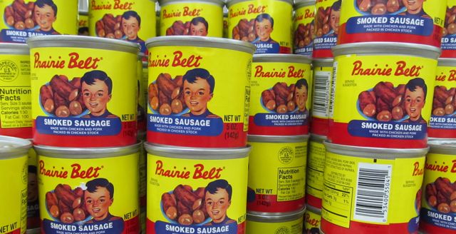
Prairie Belt Smoked Sausage!
Holy cow – this package could be Mrs. Sullivan’s pies’ nephew! Yellow background, brand name in red script, the whole nine yards!
And by “the whole nine yards” I mean, of course, the main anachronicity (a word I first coined here) of this package: a tenth-generation photo of a bowl of smoked sausage coupled with artwork of a cute little fella in the foreground comprising a label designed when canned food label lithography was still in its infancy! Probably!
Given the juxtaposition of sausage and small boy we must therefore assume that Prairie Belt Smoked Sausage are made from small bo– Oh, look, my attorney just popped one of his blood pressure pills.
I’m joking! My only point is that the image of the prepubescent Mathersesque young man looks like it was painted over six decades ago! The subject of the painting, if he’s even still alive at this point, is well into retirement, dealing with the horrors of those infamous Obamacare Death Panels, or being pushed off a cliff by Paul Ryan, depending on your political persuasion. (Remember, we are not a political blog! I’m Ted Parsnips and I approved this parenthetical aside.)
Actually, comparing the Prairie Belt boy to Jerry Mathers would be inaccurate. Perhaps a better descriptor would be Boothesque.
Indeed, he bears a stronger resemblance to little Billy Booth – you know, Dennis’ pal Tommy on the 1959-63 series “Dennis the Menace.”
Look! Look!
He kinda looks like him, right? Little bit? Sure.
So after discovering these anachronistic delights, I did exactly what you’d have done: I bought like thirty cans.
I mean, when am I going to find this stuff again? Besides, Christmas is right around the corner. (This year, give the gift of good taste, mechanically-separated chicken and pork spleens. Give Prairie Belt. Clearly I should have gone into advertising.)
Unfortunately, I wasn’t thinking when I was getting ready to come home – I packed them all in my carry-on bag. As the 5-ounce Prairie Belt Smoked Sausage cans were over the 3-ounce TSA limit and resembled, in size and shape, containers of Sterno, I was required to throw them away there at the gate or consume them before boarding. As you would, I chose the latter.
I’m not a greedy man, so when I started slowing down by can 17, I offered some to the others in line at 75¢ a can, exact change only (a potential 24¢ per can hit I’d be absorbing), but there were surprisingly no takers. I managed to get down one more can but then cursed my small, trim abdomen as well as the TSA bastards who would be feasting like kings that night on the dozen cans I surrendered to the trash. (In retrospect I should have opened them all and dumped the contents directly into the garbage to prevent this.)
And here’s the thing: Turns out the Sterno comparison was rather apt: Six gin and tonics into the flight we hit some turbulence and everything came back up, burning the hell out of my throat. What I wouldn’t have given to be sitting next to that wicked old gypsy woman who could have conned me out of my first generation iPod Mini for a stick of Beemans to get the taste out of my mouth! I bet the two passengers on either side of me would have appreciated this as well.
Tomorrow: Something shorter.
-
Delightfully Anachronistic Package Design: Virginia Edition!
AS YOU KNOW, due to a chemical imbalance in my brain that’s been traced to my childhood habit of sneaking into the attic, tearing off swaths of insulation and eating it like it was cotton candy, when I see a package of something – usually food (but not always), usually at a dollar store (though there are exceptions) – and it has the look of something that has existed just as it is now for the past twenty, thirty, forty, fifty, even sixty years, I get all tingly – as though the tiny Fiberglas shards permanently impaled throughout my organs have suddenly become electrified.
That is to say, it’s neat-o when you find stuff where they probably haven’t changed the design of the package for decades.
On my recent trip to Hill, Virginia, I found not one, not four, but three such items! Today we’ll look at the first one!
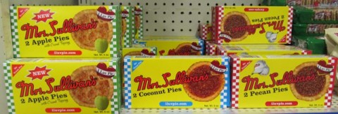
Mrs. Sullivan’s pies!
Since we’re in the country, I felt it appropriate to ask the pie box to pose atop a fence post in a field.
The checkerboard element on the sides, the cropped pie photo, the thick, red script of “Mrs. Sullivan’s” – it all adds up to just one thing: This package looks like something you’d find on a shelf back in oh, say, 1937. As though they haven’t changed their packaging for seventy-five years. And, Land O’ Goshen!, when you go to their website, you’ll find that that’s precisely how long they’ve been in business!
Oh, sure, they’ve added stuff – “No Trans Fat,” a website address, hats you can buy, and a heartpie shaped logo with the unfortunately spelled “I Luv Pie” motto – but the core of the pie box, the pie box core, if you will, looks like it’s three-quarters of a century old. And by Godfrey, that’s why we love it! Or, eugh, “luv” it.
I sampled the coconut pie and the pecan pie. They were both magnificent. Don’t believe me? Want to try some of Mrs. Sullivan’s pies for yourself? Perhaps you want to buy some related pie-ma’bilia? Or download the free track “Haulin’ Pies”? Go to their website and poke around. And don’t worry about your personal information being compromised – according to carefully worded verbiage thereon, “Mrs Sullivan’s ® first priority is your online security that is why we protect you with the best secured site Certificate the web has to offer.”
I made sure to bring home a few pies, too. They don’t have Mrs. Sullivan’s pies here. I told you Los Angeles is a filthy toilet!
Whoa, Evalina, stop-a ringin’ my cellular phone! ‘Cause I’m a-haulin’ pies in Memphis, and I don’t think I’m ever comin’ back home!
-
Delightfully Anachronistic Package Design: Summer 2012 Edition!
IF THERE’S SOMETHING that we all can agree on in these troubled economic times, it’s that everyone enjoys delightfully anachronistic package design – and rightfully so.
And by “delightfully anachronistic package design,” I mean packages – usually of food, and often bought at a local dollar store – that have the look of something that was designed decades ago and never updated. I find this phenomenon absolutely delightful and now…? Now, friend, so do you. Like watermelon-flavored Visine, it’s a treat for the eyes. Oh ho ho, watermelon-flavored Visine! Where do I come up with this stuff?
So, uh, here’s a bunch of things I found that look old.
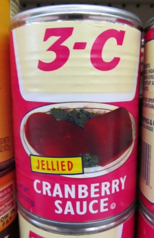
3-C Jellied Cranberry Sauce That Looks Like It’s From, Oh, Let’s Say the Mid-1960s
I found these in a wonderfully ratty dollar store in Carson, California months ago. But I’ve been saving the photo for a special occasion. Tonight’s the night, baby! Tonight’s the night!I didn’t buy them, I just took a picture (because it’ll last longer). What does the name “3-C” signify? Look, I just told you I didn’t buy it, so I have no goddamn idea! Let’s say it stands for priCe, Cwality, and, eh, Cranberries. I’m sure it’s a fine product.
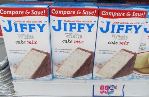
Jiffy White Cake Mix Looks Like It’s From the 1930s
Yes, I’ve covered Jiffy mixes in depth previously. All of their packages have a distinct anachronistic look to them. But this is the first time I saw the white cake mix before. White cake mix? That’s racist! And delicious!Libby’s Chunk and Sliced Pineapple Looks Like They’re From the Mid 1960s
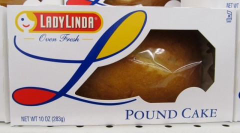
Now here’s a tough one. I found these at my local Dollar Tree and the package design is very new – I forget what Libby’s canned fruits used to look like, but one thing’s for sure, brother, they didn’t look like this! These have a very 60s kind of style to them, but by Godfrey, if I find out this is an intentional attempt at a “retro” look, then they’ll be immediately disqualified and not allowed to compete. I’d like to think, and now you do, that this is just a label redesign that somehow looks old to me (and now you). Dare I include it here? As it turns out, I already have.Lady Linda Pound Cake Looks Like It’s From the 1970s
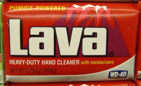
Ha! A so-called pound cake – that weighs ten ounces! (Settle down, settle down – I’ve already got my attorney on top of this.) Anyway, the lovely Lady Linda logo looks like something from about forty years ago, doesn’t it? …Kind of? Look, they can’t all have the striking visual anachronicity (a word I’ve apparently just coined and will soon trademark) of Jiffy cake mixes.Lava Heavy-Duty Hand Cleaner Looks Like It’s From the Late 1960s
Aside from the addition of the WD-40 logo to the bottom and a few minor changes to the text (the omission of the exclamation point after “PUMICE-POWERED,” changing “THE HAND SOAP” to the current “HEAVY-DUTY HAND CLEANER with moisturizers,” among them) Lava’s wrapper is practically unchanged since 1960s, which is particularly amazing and wonderful. It’s such a great design it’d be a shame to change it. Lava soap has always been a small, specialty brand, and I bet if it had been owned by some huge Big Soap corporation, we’d be looking at swirly design things all over the package. Either that or photo-realistic globs of glowing, shimmering lava with highlights galore.Say, look – it still pretty much matches its corresponding 70s Wacky Package:
By the way, like you, I love Wacky Packages, used to collect Wacky Packages, and permanently stuck Wacky Packages to the closet door in my bedroom. And I still say, this is the worst parody name in the entire Wacky Packiverse. “Lova”…? What the hell…?! Clearly Art Spiegelmaus and Bob Shtewart just wanted to knock off early the day they came up with this one. “Lava Soap…Hmm…Tough one…Bava, Cava, Dava, Fava, Gava…” “Lova Soap! These are eight year olds we’re writing for. Good enough! Now let’s hit Buffalo Wild Wings for lunch!”
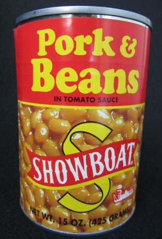
Showboat Pork & Beans in Tomato Sauce Looks Like It’s From 1923
Here’s a secret the Bush’s Beans people – even the talking dog – don’t want you to know: They’re the company behind these value-priced Showboat Pork & Beans. Okay, maybe they don’t care if you know, since their name and website are listed on the back of the label. You’re probably asking aloud “Why does this jackass Ted think the can looks like it’s from 1923?” I’ll tell you why if you just shut up a minute: the typeface used for the words “Pork & Beans” is in fact the same used throughout a 1923 Sear & Roebuck catalog I found in Nana Parsnips catalog heap (in what used to be the shower). Add to that the “Showboat” name and logo, and, well sir, you’ve got a canna beans that looks like it’s 89 years old!Breakstone’s TempTee Whipped Cream Cheese Looks Like It’s From 1982
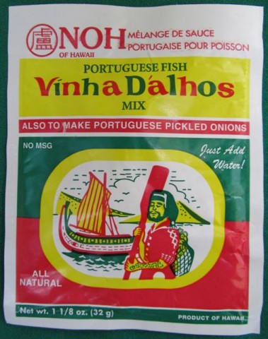
We don’t normally have Breakstone products out here in the filthy toilet that is Los Angeles, but oddly, they do turn up occasionally in – where else? – the 99¢ Only Store. And when they have TempTee whipped cream cheese, brother, I snatch it up by the palletful! So you can consider this entry a mini-What’s Bueno at the 99¢ Only Store post too – this stuff is just that good. Anyway, the pseudo-handwritten product name, the bright pink color and the little yellow stripes all scream the early 1980s. But be warned – the name and color seem to imply that this is some sort of light version of cream cheese – this, my calorie-counting pal, is not the case. It’s just whipped, but has the same amount of fat as regular cream cheese. This is why I limit myself to just one tub for dessert, during “Wheel.”Noh of Hawaii Vinha Dalhos Portuguese Fish Mix Looks Like It’s From the Late 1950s
Just as you would, when I saw this at Big Lots for just 80¢, I had to try it. And not because I was at all curious about the taste, either – it’s that amazing three-color design that we found so nifty – to use the very vernacular of the era that I think it kind of looks like it’s from. Anyway, I had Ildefonsa fry me up some fish with it and it came out, well, okay.The thing is, your best, tastiest fish today are your overfished fish – your European seabass, your snapper, and my favorite, your orange roughy. A good rule of thumb is the more endangered the species and the higher the price, the tastier the fish. So I got Ilde up at five one morning last week, gave her twenty bucks to pick me up a couple of good, thick, New York-cut orange roughy filets from the Santa Monica Fish Market and even gave her an extra buck to help with fares on the six buses she’d need to take to get there.
Maybe it was the deliciously overpowering taste of the fish sauce and the fact that Ildefonsa oddly decided to cut them into eight uniformly rectangular slices before serving them to me, but they just didn’t taste like orange roughy. But she insisted, in her angry broken Germ-glish, that it was orange roughy. As much as I personally dislike the woman and constantly threaten her with deportation (more to scare little Kayla when she doesn’t behave), “Fat Frau Blucher” as I call her (she doesn’t get it!) has a good heart. She tells me it was Mr. Whisker’s birthday and that was why I found this box in the garbage…
…along with all the breading she patiently scraped off. (Damn cat’s apparently allergic to gluten now.)
Well, we all had some fun, but the booze is wearing off so I think we’re done here for now. Also, it’s just now occurred to me that we usually celebrates the pets’ birthdays along with the kids’, all on one day, December 25, every other year. Huh.
-
Delightfully Anachronistic Package Design: Jason Bread Crumbs!
Ever since I got whacked in the head with a bright green vinyl-covered putter by some obnoxious six-year-old in the unruly golfing party (“mob” was more like it) behind us some years ago at Putt-Putt Palace down in Redondo (Long gone! Closed down after the settlement!) I’ve had this admittedly unusual preoccupation with anachronistic package design.
You see, when I happen upon a package of something that looks particularly old, I say to myself, “My, but that package looks rather anachronistic; that is to say, it exists here in the present yet is representative of a previous time – and I find this delightful.”
Recently I was in my local ethniceteria, that is to say, a place that sells foods that exist here in this country yet are representative of other cultures – a sort of exotic food “bazaar” if you will – and I found this:
Above: Jason Bread Crumbs! Also available in blue!
And as you would be – hell, as you are now, just looking at it here on my site – I was positively enchanted by this package design. I know you’ll agree that it looks like something we’d find if we had a chance to root around Saul Bass’s kitchen cupboards in the late 1970s.
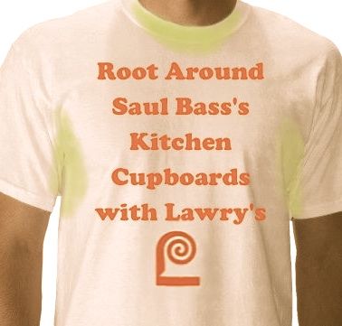
Unfortunately, I was not the grand prize winner in the 1978 Lawry’s Seasoned Salt “Root Around Saul Bass’s Kitchen Cupboards” Sweepstakes so we’ll never know exactly what was in there. (And lucky winner Della Frankinhoff passed away in 1998 before I got a chance to interview her.)
I did get a third place t-shirt though. My hyperhidrosis (chronic sweating) coupled with my chromhidrosis (colored sweat, in my case, yellow-green due to a neonatal addiction to pistachio instant pudding) rendered it unwearable in a matter of weeks. But thank God for old family snapshots, right?!
On an unrelated note, I really need to hire some sort of online marketing guru to figure out why no one seems to visit this site more than once.
-
Delightfully Anachronistic Package De– Wait, No, Nevermind!

As you know, when I happen across a product with delightfully anachronistic package design, why, I just feel as though I’m going to bust, I get so excited, and–You know, if I’m ever going to win the respect of the rest of the internet, I’d better play by the rules, and in this case that means joining hands in solidarity with my online peers, my sister sites, you might call them – Wikipedia, and Reddit, and all the rest, sure – and louvering the site today. I was going to say “shuttering” but I know you hate that term as much as I do.
…And yet, I have to ask: Doesn’t it seem odd that on Martin Luther King Junior Boulevard Day, we celebrated Betty White, and now today, we’re going black?
Will we ever go back? They say you don’t.
But I think we will.
You’re probably wondering what all of this is about. It’s about SOPA. Which, if I remember my decades-old junior high Spanish, as well as my right-now living-in-Southern-California Spanish, means “soup.”
I think that about says it all.
So I hope that all five or six of you that may visit the site today understand that this is bigger than just some delightfully anachronistic package design (every example of which I find makes me more giddy than you can possibly imagine).
This is about Spanish – or quite possibly Mexican – soup.
-
Allens Inc. Quality Vegetables: The Undisputed Masters of Delightfully Anachronistic Package Design!
AS YOU’RE WELL AWARE by now, I’m always on the lookout for anachronistic package design. Some have suggested that my fascination with packages that look old but aren’t may indicate a mild form of OCD, perhaps itself a symptom of autism brought on when I was inoculated as an infant for rinderpest. (Growing up in the isolated rural farming community of Greenwich, Connecticut, my pediatrician was also our livestock veterinarian, and I suspect he got his syringes mixed up. In further support of this theory is the fact that none of our cattle ever contracted rubella.)
Yet others, myself among them, have noted that this may just be an easy way to come up with content that, according to my preoccupation with checking Google Analytics every night at 12:01 a.m., less than six people on average worldwide will be reading anyway.
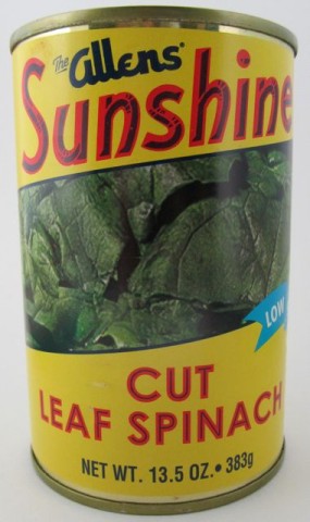
Anyway, here’s a can of spinach that looks like it’s from the late 1940s. But it’s not!
It totally looks exactly like it’s more than half a century old, right? And before you challenge me with “Well, how do you know it’s not?” I’ll tell you that I know it’s not because its label feature a UPC code, a recycle symbol, a website URL, a banner reading “Low Sodium” and microwave directions! Did they have any of those things back then? Did anyone care about salt in the late 1940s? No, of course not. I win.
This can of cut leaf spinach, destined eventually for some sort of glorious spinach/mayonnaise/artichoke dip that I’ll no doubt end up eating like soup once I run out of pita chips, is from the good men and women at Allens. They’ve been packing vegetables that we’ve all been enjoying since 1926.
What’s neat is they’ve got a very modern, up-to-date website, yet most (sadly, not all) of their brands (and I counted seventeen different names they sell their wares under!) feature labels that look like they were designed fifty or sixty years ago.
Isn’t that awesome?!
Look at their delightfully anachronistic East Texas Fair brand of canned blackeyed peas, field peas (I have no idea either) and lima beans:
How amazing is that? The logo for this brand looks like the title card for a 1947 Walter Lantz Cartune. I don’t know which one, but it just has that look. You know what I mean.
And now look at this collection I’ve amassed of some of their other labels. Even their licensed Popeye brand looks like it came right off the shelf of a 1950s corner market. Again, folks: These are all canned goods currently available on grocery shelves across this great country of ours for you to buy! Not decades ago! Today! These exist today!
And don’t even get me started on the stunning label on that can of Alma cut green beans. Good lord, I want that as my wall paper in every single room of this house.
And now a personal message to the wonderful people of Allens Inc. – don’t you dare change a thing. Your canned vegetables with delightfully anachronistic package design are, well, a delight. The six or so people worldwide who visit this blog on any given day will back me up on this.
-
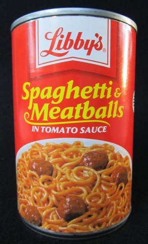
Delightfully Anachronistic Package Design: Libby’s Spaghetti & Meatballs!
ONCE AGAIN, I found a food product with delightfully anachronistic package design at the 99¢ Only store. What is it with me and these things? God only knows. (I brought it up at group last week but Dr. Aaronson told me it wasn’t germane to our goal and asked me not to mention it again. I keyed his Mercedes.)
As you know, I get all sweaty and excited when I see some sort of food product, nearly always at the 99¢ Only store, whose package design belies its very…existence in the year that it currently…is. Do you follow?
Take for instance the specific item I’m going on about this time. It’s a can of Libby’s Spaghetti & Meatballs. In tomato sauce.
The thing is, it doesn’t look like a food product you’d see here in 2011, right? I’m not talking about the actual food inside, but the way the label is designed. It looks like it’s much older. Right? It’s not just me, right? Okay.
Now you’re thinking to yourself, “What an idiot – he shops at the 99¢ Only store for God’s sake, where all they have is garbage – clearly this disgusting product is decades old, he’ll get sick eating it, and then maybe he’ll learn his lesson already.”
But no! That’s just it! It’s a current product!
And yet the color scheme, the typeface, everything screams, I dunno, the mid-1970s!
“But how do you know it’s not from the mid-1970s?” you sneer derisively.
Ready for this? Because in the mid-1970s, back then, Libby’s had a contemporary logo! Remember?
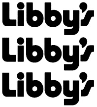
By the way, thanks to http://trade.mar.cx/ where I found that.Now, most of the delightfully anachronistic package design foods we’ve visited over the past months have labels that we must presume have endured for years and were never updated. Libby’s, however, is unique on account of it was updated, and now it looks dated. Not terribly dated, but dated nonetheless.
And here’s something else: Libby’s meat products, like these delicious spaghetti and meatballs – and brother, they were great! – are from the good people at ConAgra Foods. But Libby’s vegetable products, like your gourmet tiny early June peas, your whole kernel succotash and the like comes to you from the good folks at Seneca Foods.
Confused? Don’t worry. You’re the only one who read this far.
Ted Parsnips
?>