-
Allens Inc. Quality Vegetables: The Undisputed Masters of Delightfully Anachronistic Package Design!
AS YOU’RE WELL AWARE by now, I’m always on the lookout for anachronistic package design. Some have suggested that my fascination with packages that look old but aren’t may indicate a mild form of OCD, perhaps itself a symptom of autism brought on when I was inoculated as an infant for rinderpest. (Growing up in the isolated rural farming community of Greenwich, Connecticut, my pediatrician was also our livestock veterinarian, and I suspect he got his syringes mixed up. In further support of this theory is the fact that none of our cattle ever contracted rubella.)
Yet others, myself among them, have noted that this may just be an easy way to come up with content that, according to my preoccupation with checking Google Analytics every night at 12:01 a.m., less than six people on average worldwide will be reading anyway.
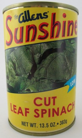
Anyway, here’s a can of spinach that looks like it’s from the late 1940s. But it’s not!
It totally looks exactly like it’s more than half a century old, right? And before you challenge me with “Well, how do you know it’s not?” I’ll tell you that I know it’s not because its label feature a UPC code, a recycle symbol, a website URL, a banner reading “Low Sodium” and microwave directions! Did they have any of those things back then? Did anyone care about salt in the late 1940s? No, of course not. I win.
This can of cut leaf spinach, destined eventually for some sort of glorious spinach/mayonnaise/artichoke dip that I’ll no doubt end up eating like soup once I run out of pita chips, is from the good men and women at Allens. They’ve been packing vegetables that we’ve all been enjoying since 1926.
What’s neat is they’ve got a very modern, up-to-date website, yet most (sadly, not all) of their brands (and I counted seventeen different names they sell their wares under!) feature labels that look like they were designed fifty or sixty years ago.
Isn’t that awesome?!
Look at their delightfully anachronistic East Texas Fair brand of canned blackeyed peas, field peas (I have no idea either) and lima beans:
How amazing is that? The logo for this brand looks like the title card for a 1947 Walter Lantz Cartune. I don’t know which one, but it just has that look. You know what I mean.
And now look at this collection I’ve amassed of some of their other labels. Even their licensed Popeye brand looks like it came right off the shelf of a 1950s corner market. Again, folks: These are all canned goods currently available on grocery shelves across this great country of ours for you to buy! Not decades ago! Today! These exist today!
And don’t even get me started on the stunning label on that can of Alma cut green beans. Good lord, I want that as my wall paper in every single room of this house.
And now a personal message to the wonderful people of Allens Inc. – don’t you dare change a thing. Your canned vegetables with delightfully anachronistic package design are, well, a delight. The six or so people worldwide who visit this blog on any given day will back me up on this.
Ted Parsnips
?>


