The Long-Awaited Final 10 Products with Anachronistic-Looking Packaging That I Found at the 99¢ Only Store That You Need To Know About, I Guess

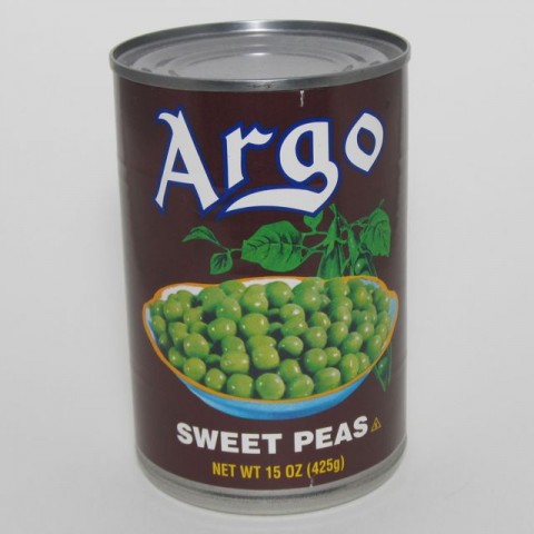
These Argo Sweet Peas look like they’re from…the 1940s.
Proof of Its Modernity: Please Recycle logo on label.
Where You’d Expect to See It: On a shelf behind Sam Drucker in an episode of “Green Acres.” Or maybe on a stool next to Orson Welles in a recording booth simultaneously inspiring and infuriating him.
Buy It Because: Vegetables are good for you.
• Many years ago – decades probably! – someone decided that a deep, rich brown – a color you might associate with packaging for, say, chocolate syrup or perhaps motor oil – was a good choice for the background of the label for a can of green vegetables. Add to that an ancient typeface spelling out an archaic-sounding brand name, an illustration of peapods on the vine that’s placed not to the side of a muted color photograph of a big dish of peas, but mostly hidden behind it, and you’ve got yourself a contender for best package design of 1943. This is one of my favorite antiquated labels, and now it’s yours, too. There’s something very charming about the simple, old-fangled design. Don’t you ever change, Argo Sweet Peas!
Pages: 1 2 3 4 5 6 7 8 9 10
Posted by Ted on July 12, 2011, 9:00 AM.


