-
Delightfully Anachronistic Package Design! The Update YOU Demanded!
FROM ALL THE CARDS AND LETTERS we’ve been inundated with here since we ran that piece on beef stew some time ago, Thursday I think it was, it’s clear that many of you felt we gave the beef stew short shrift.
A pal from Rochester Hills, Michigan writes, “Ted! How about a recipe for that beef stew you featured on your blog recently?”
What are you, an idiot? It was beef stew in a can. Open the can. There’s your recipe.
Still others wanted to know more about the story behind the beef stew, as well as the story behind it.
A new reader, Best-Penis@MaxGentlemen.com, chimes in with, “Click here for the only Male enlargement supplement that has been PROVEN in clinical trials to enlarge your penis – safely, quickly, and importantly – PERMANENTLY.”
Okay, okay – we get the picture! You want to know more about the beef stew!
…Well, you’re out of luck, because we’re moving forward, not stumbling backward. But that doesn’t mean we won’t be covering other products in delightful anachronistic package design.
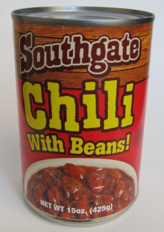
In fact, here comes one right now – it’s a picture of a can of chili from the same company that made the beef stew! And it looks old too! But isn’t!
This can of Southgate Chili With Beans! looks like it’s from…the early 1970s.
Proof of Its Modernity: “Contains: Soy.”
Where You’d Expect to See It: Stockpiled in the cupboards of the camper for a series of quick, inexpensive dinners on our infamous family trip to Florida in 1973 that were never touched because there was no way in hell that Mom was going to be eating anything out of a can sitting at that uncomfortable, tiny table in the back of that “goddamn cramped, flimsy deathtrap on wheels” after careening down I-95 in it all day long.
Buy It Because: Brings back fond memories of our family trip to Florida in 1973.They sell these at both the 99¢ Only store as well as its arch enemy, Dollar Tree. I saw them at Dollar Tree first, and they only had the beef stew, and now, a few months later, there’s a whole slew of Southgate canned foods.
I probably sound like some asshole loser hipster who posts embarrassingly fawning comments on “photo streams” of vintage grocery items on Flickr, but by Godfrey, I love the color scheme of this thing – the bright red below a band of rustic wood planks, and then over that, there’s “Southgate” in a slightly old Western-style typeface.
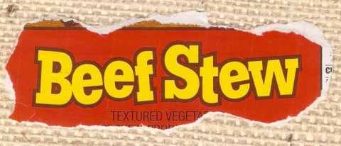
Actually, forget what I said earlier! Let’s stumble backwards momentarily and revisit the beef stew here, huh? That can looked delightfully more anachronistic because of the big thick letters spelling out beef stew that were slightly askew and toggled. Can we get an image of the label…?
I’m telling you, you can’t go wrong when you set your letters askew and slightly toggle them!
…Back to the chili! With Beans!
Speaking of which, if there’s one word that doesn’t need an exclamation point after it on a product label, it’s “Beans!” but damn it, they’ve gone and put one there and I – and now you – love them for it. Maybe it’s a sort of subtle punctuational hint at the uncontrollable gas you’ll be experiencing later. Marvelous! Marvelous!
Though credited on the can as manufactured by “SouthGate Foods,” it seems the true makers behind this delightfully anachronistically packaged repast is a company called Vietti Foods that have been making delicious things for you, and now me, to eat since 1898.
I really have no one to blame but myself for this blog’s lack of readers.
-
Holy Crap, I Found Another Product with Delightfully Anachronistic Package Design!
IT’S BEEN A WHILE since I indulged you, as well as myself, in that most unusual as well as rewarding of my hobbies: enjoying looking at products, mostly found at dollar stores, with delightfully anachronistic package design. Oh, it’s a harmless little lark, a simple distraction, really – marveling at contemporary products, yes!, currently on the market, in boxes or cans or bags that look like they’re right out of the Flickr “photo stream” of some asshole loser hipster who collects old grocery products, and wondering, oftimes aloud to myself, or to other shoppers nearby, “How in this day and age, I wonder, how in this day and age did the manufacturer of this particular box of soup mix (or jar of pickled beets or what have you) not look at their product’s label at some point over the last thirty-odd years and think ’Christ almighty, maybe it’s time we updated this packaging – why, we’ven’t done an overhaul on it since, what, 1967!’ But thank God above they haven’t, right?, because the result is spectacular – just spectacular!”
So anyway, here’s a can of beef stew that looks old.
-
Yet Another Product with Delightfully Anachronistic Package Design!
EVER SINCE I CAN REMEMBER, I’ve enjoyed looking at grocery items packaged in cans, boxes and bags that somehow seem like they’re from a bygone era.
In fact, this little obsession of mine goes back so far that even as a strapping, ebullient boy I was fascinated with the anachronistic look of various grocery products when they were perfectly contemporary – yet I was so preternaturally forward-thinking that I envisioned how out of place they would be if for some inexplicable reason, decades later, they retained that same package design.
I also visualized myself as an adult keeping a blog and writing at length about this, though of course at the time, I had no idea what a “blog” was. I presumed it to be either some sort of farmable swampland or a hybrid frog/animal that starts with “bl,” though what really confused me is why the hell I would be writing about package design when surely my marshfarm with its unholy crossbred amphibimammals would be much more interesting.
Knowing this, it came as no surprise to anyone in my family when I was blessed with precocious puberty, though it wasn’t without its drawbacks. I recently bumped into my kindergarten teacher who confessed to me while it was handy having me around to rearrange the heavier classroom furniture, she was happy to advance me on to the first grade at the end of the year (She found the chest hair that peeked out of the collar of my striped Zoom rugby shirt “disconcerting.”) – this despite the fact that I had a lot of trouble differentiating lowercase p and q. I still think if she had bothered to sqend a little more time with me, I might have turned out puite differently.
Anyway, that’s neither here nor there. This is what you came here for:
This box of Nabisco Grahams looks like it’s from…the late 1960s.
Proof of Its Modernity: “NO HIGH FRUCTOSE CORN SYRUP” on side panel.
Where You’d Expect to See It: On Miss Gibson’s desk – for snack.
Buy It Because: “NO HIGH FRUCTOSE CORN SYRUP”I got these in the 99¢ Only store – no surprise there. What’s startling is that they were really good and I wish I bought ten boxes. (Too late! They’re gone!)
Like you, I prefer my graham crackers to be liberally coated in cinnamon and brown sugar. But as a nude graham cracker goes, these are the best I’ve had. How did they end up in the 99¢ Only store? It’s a mystery. The bigger question is why Nabisco decided to give this the bright, bold package design look of the late 1960s. Am I complaining? No!
…Well, a little bit, but only because I just read the other side of the box and it turns out they were made in Mexico. Well, that clears up the first mystery, anyway.
-
Another Product From The Dollar Store With Delightfully Anachronistic Packaging That You’ll Want To Know About!
Like you, I’ve got this weird thing for food items I find at the dollar store that feature package design that looks very dated! So you’re not alone!
Today’s offering is a can of German potato salad. Yes, you heard me right (if you’re enjoying this web page with some sort of text-to-speech software) – a can of German potato salad!
Take a look!
This can of READ German Potato Salad looks like it’s from…the mid-1970s.
Proof of Its Modernity: Website listed on back. I visited it and saw this:
Want information on how to create delicious, nutritional meals using READ products? Sign up to become part of our new “online community.”
They put “online community” in quotes! That’s Zooey Deschanel-level adorable! Awww!
Where You’d Expect to See It: On the workbench, empty and holding loose nuts and bolts in Grandpa’s garage.
Buy It Because: According to the label you can “Enjoy [it] hot or cold!”
I’m no longer defining just what it is that makes a package’s design look so dated because I’d be pointing out the obvious. There’s no reason to note the specific typefaces, photos, and colors that make each product appear old – you’re as big a fan of anachronistic package design as I am so you see it as well as I do. That’s why you and me get along so well, sure.
READ German Potato Salad comes to us from the local Dollar Tree. Last night I ate it. It was good. Tangy, it was. Tangy. It did give the cat gas, so just bear that in mind if you let her lick the bowl when you’re through.
Anyway, this can cost me a dollar, and I did buy it for the blog, so if you want to send me a dollar, I think that’s fair. Also the READ German Potato Salad people can send me more of this stuff for free or maybe some money for giving it a nice plug. Whaddaya say? I’m happy to get the ol’ Ted Parsnips Web Design Team back to work and have them put a banner on top that reads something like “READ German Potato Salad presents The Ted Parsnips Hour.” That’s assuming that every time you come here, you spend around an hour, which I think is a pretty fair assumption.
Now for a few thousand dollars less, we could do “The Ted Parsnips Hour, brought to you by READ German Potato Salad – the tangy German potato salad!” with the product name below mine. But I would hold up the can every few minutes while I write these posts.
Anyway, READ German potato salad people, my attorney will be in touch to hammer out the details. Let’s get this thing rolling.
-
Salt!
Well, it hadn’t been a week since I last showered you with images and descriptions of products in delightfully anachronistic packaging before the emails started coming in. “Ted, won’t you please find more products in delightfully anachronistic packaging to share with us, the readers,” so many of you wrote. Okay, okay, I give in! But you’re just getting one more…for now.
And here we are. Despite the little missus’ recent heart attack scare, I can’t keep the salt away from her. I’ve given up trying to let her dole it out via the traditional shaker and just let her pour it onto her Fritos pie right out of the canister. She’s going through a package a week, and at this rate, Morton’s is getting a little pricey. Solution? Royal Crystal Iodized Salt.

Picked up this baby at the Dollar Tree for – yes! – a dollar and believe me, brother, you’re not going to find a more delightfully anachronistic package of salt.This Royal Crystal Iodized Salt looks like it’s from…the 1970s.
Proof of Its Modernity: Mention of trans fat on nutrition label.
Where You’d Expect to See It: In the background of a photo in a print ad for Fit & Trim dog food in “Family Circle” from 1979, shot in a grocery store with all the products on the shelves out of focus just enough so you can’t read the brand names. But you’d, eh, recognize it from the color scheme, sure.
Buy It Because: For God’s sake, salt is salt. You might as well get the cheap stuff. Hell, I’d feed our six foster kids road salt if we lived in a climate where I could scrape it off the streets in the winter.
• A simple design with bold letters on a field of that deep red-orange – that’s what makes this one look old. That and the double-shield thing – I’m sure it has some sort of graphic design name – in which “Royal Crystal” is printed in white on deep blue. That thing alone looks like something you’d see as part of some sort of modern American colonial bicentennial style decorating motif, right? Oh, you know what I’m talking about. Look, the important thing is it looks like the Royal Crystal salt people designed this thing 35 years ago, and here it is, still today. I love it, and now that you’ve seen it, so do you. -
The Long-Awaited Final 10 Products with Anachronistic-Looking Packaging That I Found at the 99¢ Only Store That You Need To Know About, I Guess
Here’s that last ten I promised you weeks ago! And this is what’s going on, if you’ve just joined us: Apparently I have some weird fascination with products in packages that look like they were designed decades ago. Lord knows I’ve tried to get you interested in this, too. I thought maybe it could grow into a hobby we can share (since you evidently have no interest in competitive horseshoeing) and we could work on it during the weekends that I have you. You know, we could even take a trip to the 99¢ Only store sometime, just you and me. And…and maybe Lucinda, too, Daddy’s new…eh…roommate. Oh, you’ll like her fine.
So what I did was I went to the 99¢ Only store and I found these things. Each and every single one is currently available there! (Well, except for the two that aren’t, but we’ll get to that later.) And the thing is, they all look old, which is pretty cool. They all look old, but they’re current products. Isn’t that neat?
Now let’s dip into this final ten…with some dip!
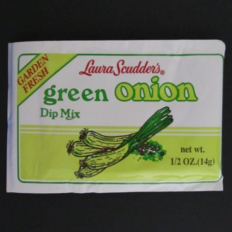
This Laura Scudder’s Green Onion Dip Mix looks like it’s from…the early 1980s.
Proof of Its Modernity: Website listed on back.
Where You’d Expect to See It: In the cupboard where your elderly widowed neighbor keeps all her spices and seasoning packets, the last of which she most recently purchased in 1983.
Buy It Because: According to their website “Once you try it, you’ll never want to use any other brand.”
• What a great old-looking design – made all the more wonderful when you realize those onions are rendered entirely with just two shades of green and one shade of brown. -
Anachronistic Food Packaging – An Important Update!
Last week, as you’ll recall, you attended Part II of my lecture series, “Understanding and Appreciating Anachronistic Package Design That I Found at the 99¢ Only Store” or whatever the hell I called it. Here, here’s a link in case you somehow forgot, and if you forgot, for God’s sake don’t tell me, because it’s just going to make me upset.
Anyway, Number 10 in that slideshow was an unassuming little roll of candy called Necco Wafers, sure.
Well! Wouldn’t you know it – as soon as the package design people at the New England Confectionery Company got wind of my article, they were so embarrassed that they immediately updated the packaging, and somehow got the new Necco Wafer rolls in the stores the very next day, all because of my article shaming them, which was not my intention – you know this!
I was celebrating the “old school” (as you call insist on calling it) look of all of these products, Necco Wafers among them. Celebrating, not denigrating! I need to put that on a t-shirt. Look for it as soon as I get my Café Press store up and running. (Soon – promise!)
So let’s take one last look at the Classic Necco Wafer packaging before it’s gone forever, and brother, let me tell you – if you come across any of these old packages, snatch them up! They’re not making any more of these wrappers! Forget buying gold – put your money in vintage Necco Wafer Rolls – if you can even find them!
Below: The End of an Era – Classic Necco Wafer packaging, 1847-2011.*
*1847 date an estimate only, based on year company was founded. Not a guarantee.

Below: The Necco Wafer of Tomorrow and Beyond – The New England Confectionery Company’s reboot of the popular “Necco Wafer” franchise.

You can’t stop progress, I guess. I’m just relieved that as a concession to us anachronistic package designophiles – you included! – that the typeface they used for the words “The Original” looks kind of classic – you know, like something you’d see on the menu of a 50s themed diner, right?
Obviously, I anticipate this mention on my blog will send demand for the chalky, delicious candy discs through the roof. I also anticipate that the Necco people will thank me by sending me a case or two of candy (but not Necco Wafers, please – something with actual chocolate in it, for crying out loud.)
-
10 More Foods I Bought at the 99¢ Only Store With Delightfully Anachronistic Package Design That I Need You To Be Aware Of
That’s right! Current products, all bought at my local 99¢ Only store – but each look like they’re from the past! It’s delightful! By God, I’m going to teach all of you to recognize anachronistic package design as well as appreciate it. Someday you’ll thank me for it.
By the way, if you missed the first installment, here it is. For you regulars – both of you – let’s get started! Let’s get started with some corn! (How many times have we all said that?)
This North Pride Cream Corn looks like it’s from…the early 1970s.
Proof of Its Modernity: Website address on back of label.
Where You’d Expect to See It: In a dump basket of off-brand, five-for-a-dollar canned items in a Hispanic grocery store off the 5 freeway on the way to Palm Springs.
Buy It Because: Makes a great side dish!
• With a whopping 5-1/4” x 2-1/2” of its label devoted to a photo of its contents, you know North Pride is serious about creamed corn. I’d like to think that the photo is a cropped image of an enormous vat of creamed corn, snapped by a factory employee who has propped a ladder against it and leaned way over the edge; now you’d like to think this, too. The North Pride people made a wise decision in making much of the label (that which isn’t dedicated to the mural of creamed corn) a bright, healthy, vegetable-y green. But I’m curious, and delighted, as now are you, as to why they decided to go with a sort of pale flesh tone for the rest of it. -
10 Foods from the 99¢ Only Store That Are Way Ahead of the Curve on That Whole “Retro Package Design” Thing
EVERYTHING old is new again, and you know that if you’ve bought Cap’n Crunch, Doritos, or Hostess Cupcakes lately. They’re among an increasing number of products decked out in “vintage” packaging aimed to appeal to nostalgic consumers. Here, let the Wall Street Journal explain it to you. (Just read the article or click through the slideshow. For the love of God, man, don’t watch the video! It’s four excruciating minutes of three people who apparently have never been on camera before talking over each other!)
Quaker, Frito Lay, and Hostess, however, are merely jumping on a bandwagon driven by braver companies: Let’s take a trip down the aisles of our local 99¢ Only store as we celebrate some of the greatest vintage-looking packages still available today from manufacturers who were so forward-thinking that they never changed their packages from whenever they first debuted.
Or at least it looks that way.
Many (but not all) are from small, private-label companies that probably contracted a graphic designer long ago to develop their packaging. They’ve seen no reason to update it, and frankly, you and me, we’re glad they haven’t.
This is not “10 Packages Desperately In Need of a Makeover,” – no no no! Indeed, we love the way these products look, and we hope that, despite the infinite power and influence this website wields over all manner of society and industry, none of the companies making these foods decides to update their product’s packaging. Indeed: They look fine as they are. By the way, they’re all great products, all made in the good ol’ USA, and each and every one from companies worth supporting!
And one last note: This is just the tip of the iceberg, brother. I got another two batches to hit you with in the next week or so, and believe me when I say that the package design just gets more charmingly anachronistic as we go along!
On with the show!

This Sacramento Tomato Juice looks like it’s from… the late 1970s.
Proof of Its Modernity: Website address on label.
Where You’d Expect to See It: At your grandparents’ house in the Bloody Marys they’ll sip while watching “Crockett’s Victory Garden.”
Buy It Because: “Sacramento Juices offer exceptional nutritional value and extraordinary taste. Enjoy Sacramento, and you’ll be serving healthy juices your whole family will love.” –from their website.
• With its largely gold label with touches of green and a little silhouette cameo of a horse and buggy, this is a particularly handsome design.
Ted Parsnips
?>